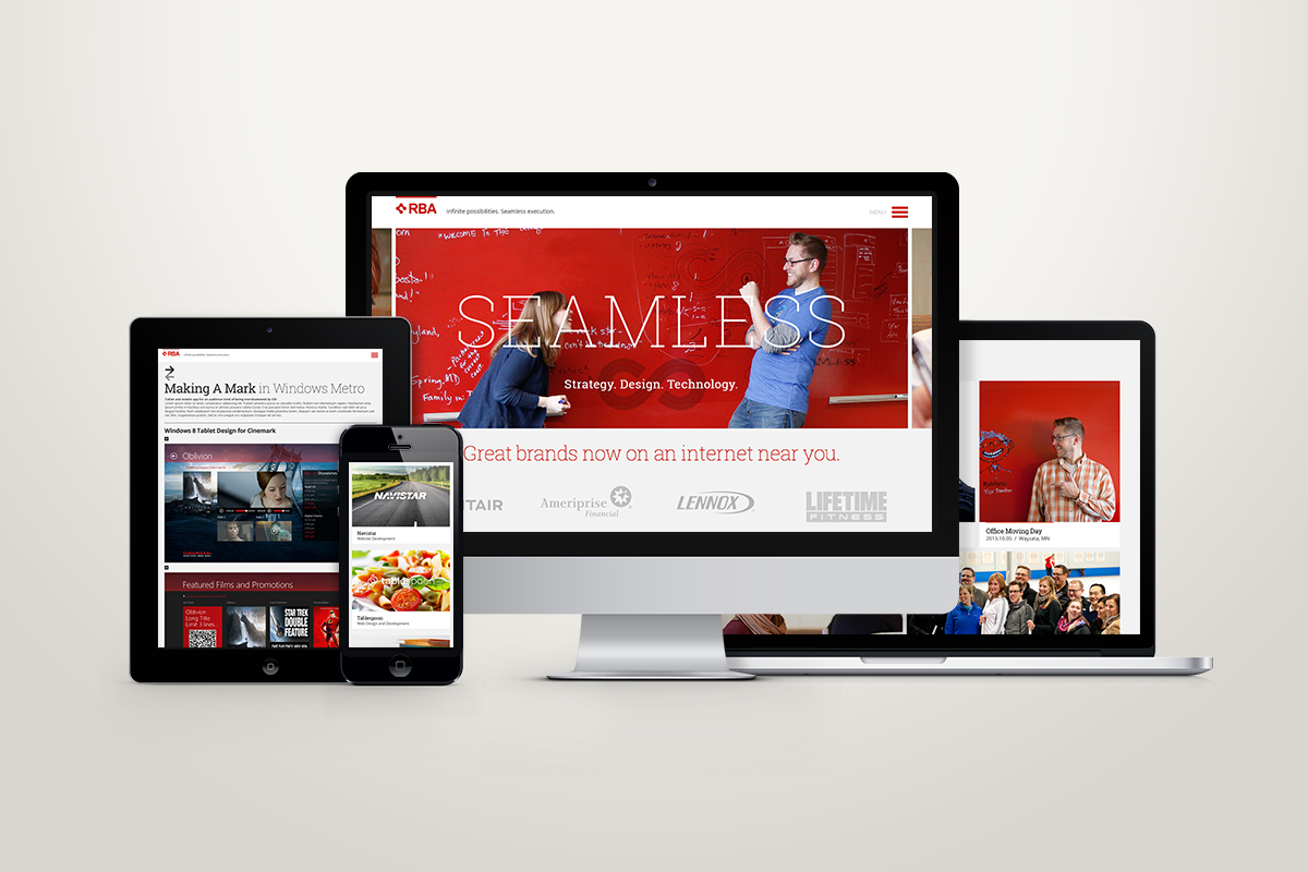
It’s a familiar story. Everyone is constantly busy, then one day you turn around and the agency site is a poor representation of what the team has to offer clients. I helped drive the process and design that left behind our old, dark website full of small boxes in favor of an experience that felt big and full of potential. We dropped the dry, technical language and shed the dated red and black color scheme to let our fun, creative yet disciplined and business-driven nature come to the surface.
A better site to attract better talent and clients
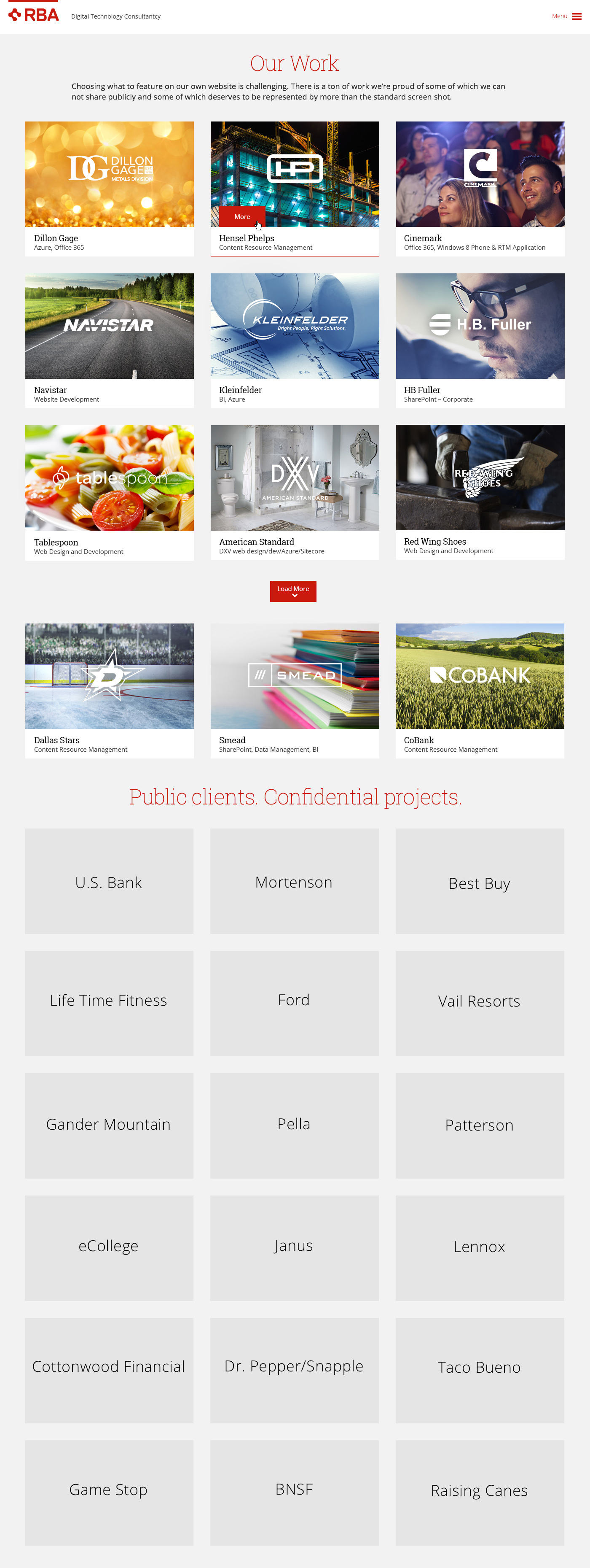
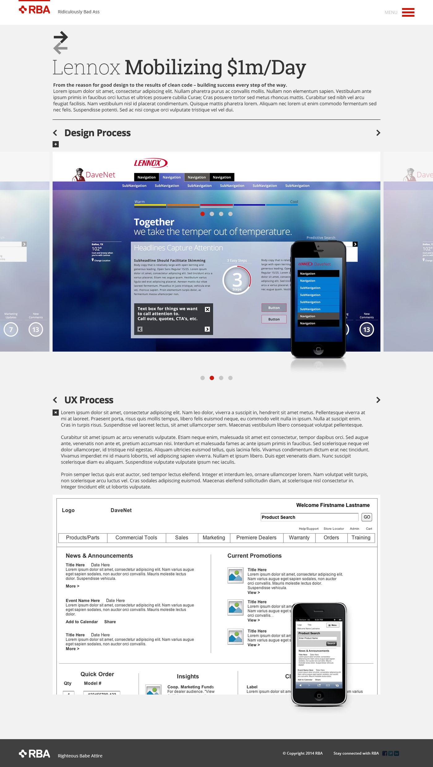
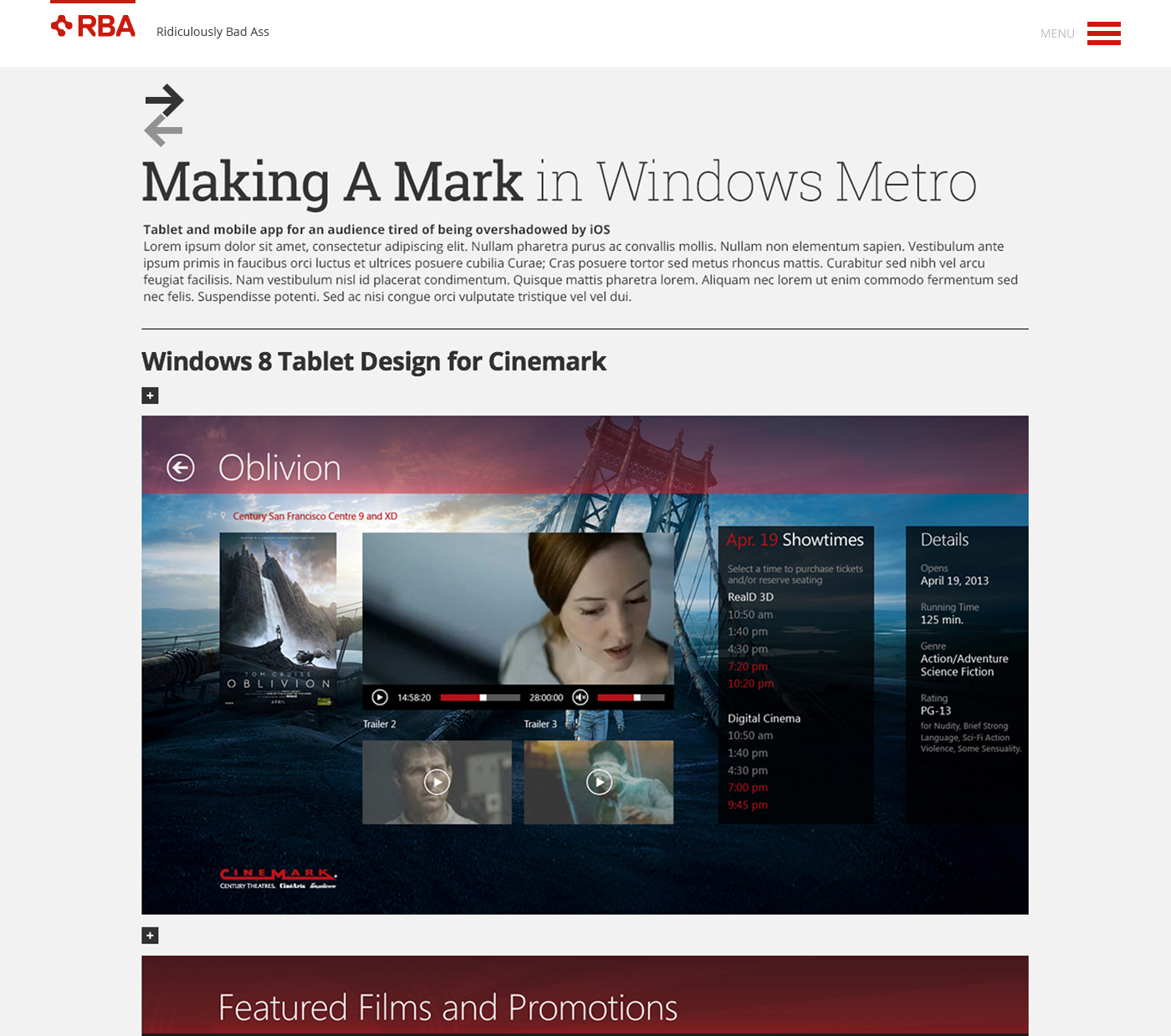
As a result we elevated the caliber of clients who included us in their consideration set and attracted better talent. We made the site easier to manage and created new content areas to showcase our thought leadership. It was also important to me to let all of our disciplines shine so the portfolio was designed to include wireframes and celebrates our process – not just the end result.
I
Client
RBA
Project
Agency Website
Agency
RBA
Creative Team
- Creative Direction / Todd Zerger
- Design / Todd Zerger + Adam Hickey
- UX / Matthew Doty
Creative Direction / Visual Design
Making sure all of our work shines
Two things that were important to me were that we get credit for an amazing client roster even though we couldn't always show the work and showing the work that typically goes unseen. Like the thoughtful wireframes and clean code that are equal hallmarks of a successful project.