Sugar Lake Lodge is a destination resort in Northern Minnesota. We felt the logo that had for years represented the family vacation and golf retreat business wasn’t setting the right tone as they worked to build their corporate retreat business.
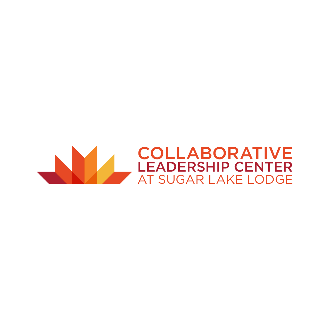
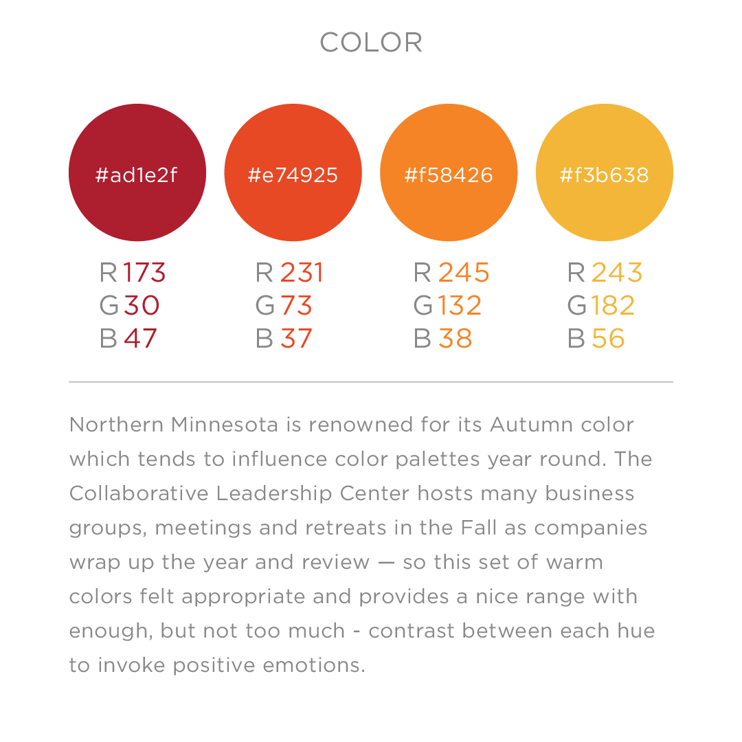
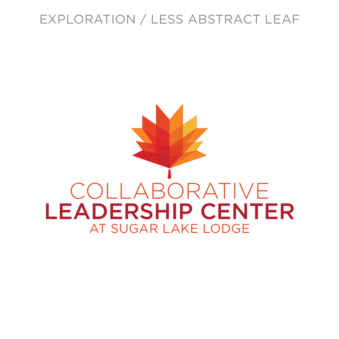
Northern Minnesota is famous for its fall color so I started with the premise that the two logos should work like non-identical twins. I worked to achieve a more modern, authoritative version for the maple leaf in the existing lodge logo. Warm colors also contrast the blue and brown of the familiar lodge logo — though I also explored the idea of a logo that would rotate through seasonal color palettes.
The horizontal format with the leaf emerging like a rising sun serves as a metaphor for business teams emerging with new found unity. It also works well with the CLC’s marketing strategy which includes paid media and a newsletter which might force a logo with a square footprint to be scaled down to fit.


