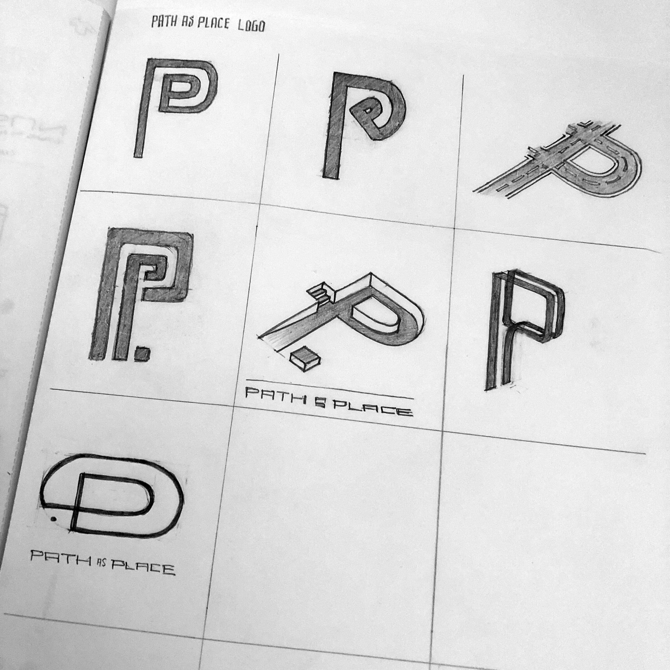
Path as Place exists as a way to summarize and promote an approach to urban planning that is human-centric in both its design process and outcomes. The purpose of the brand is to share this vision and methodology in an effort to influence the field to embrace the design of space between spaces.
The mark is a stylized letter “P” expressed as an element that adds interest to a looping path that is reminiscent of a track that folds in upon itself. This reinforces the idea that every location on the path is a place worthy of design consideration. There is always somewhere else to go to but one is not limited to being only in transit.


