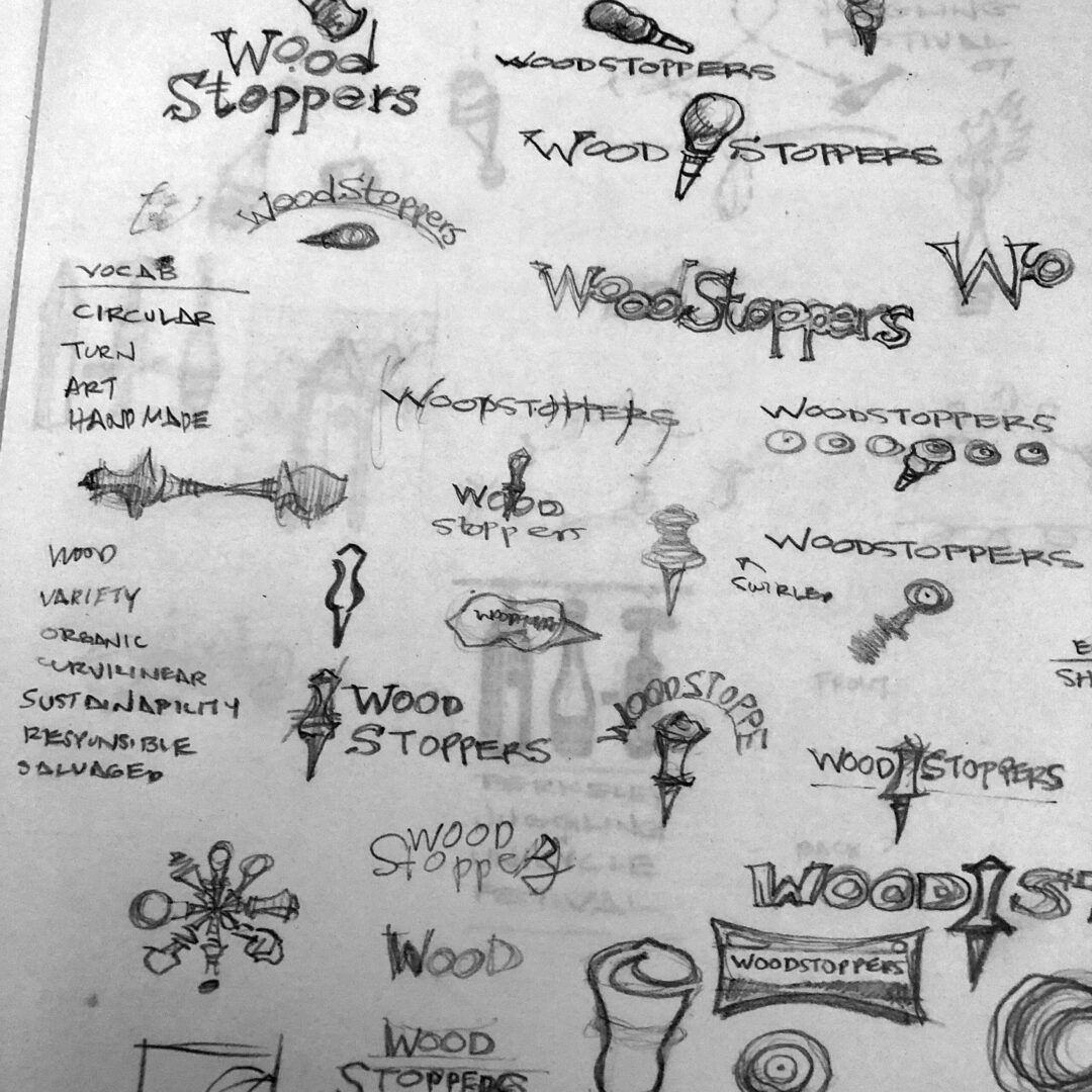
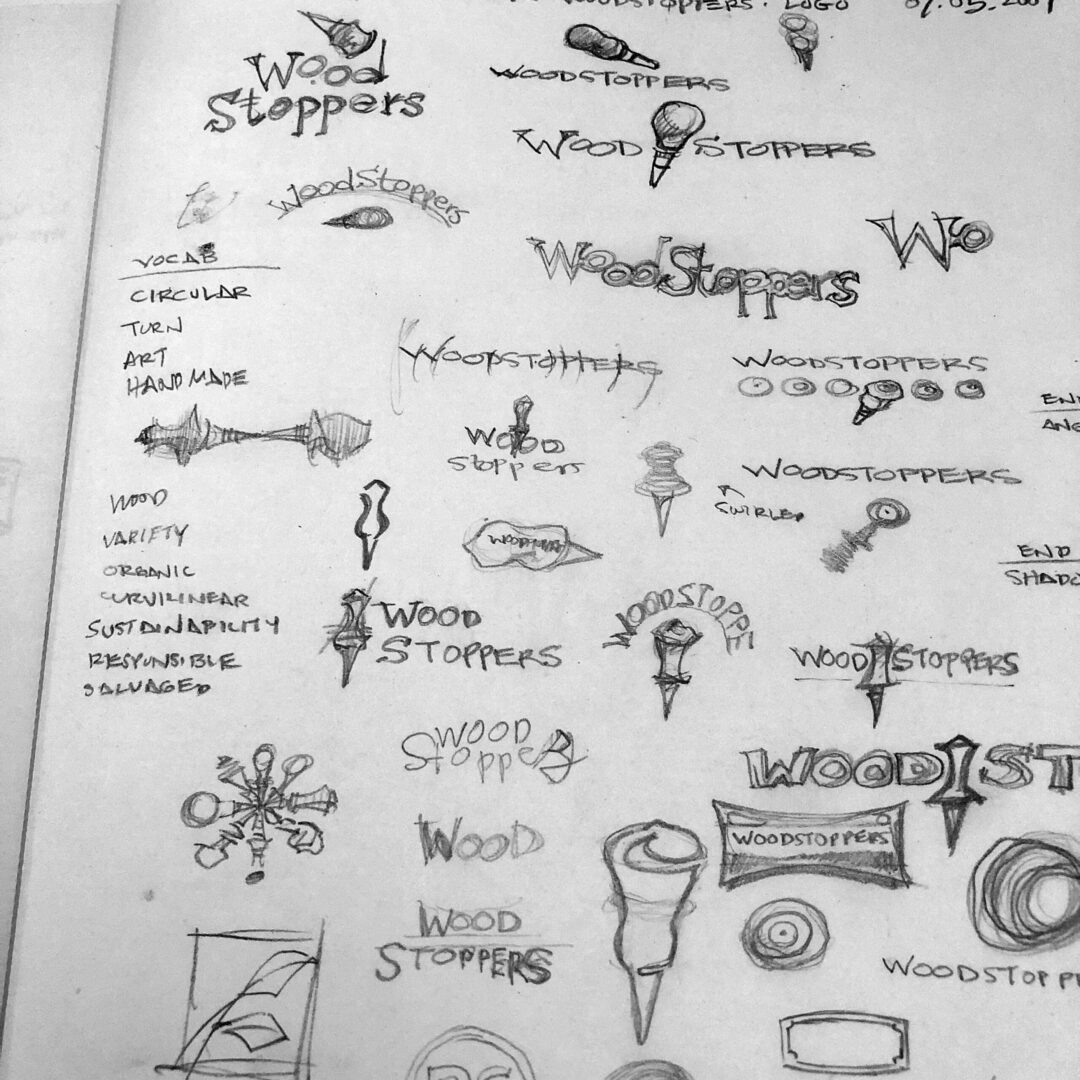
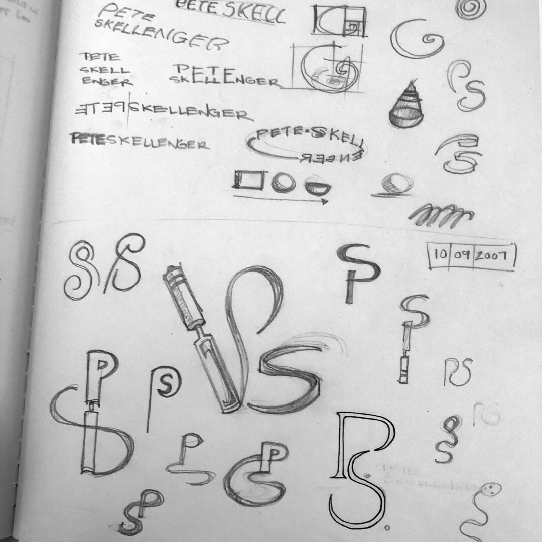
Sometimes the process of working through a logo sheds unexpected light onto core decisions about the business. While working through logos for a hand crafted wood products company intended to be called Wood Stoppers, the client came to agree that the name was going to limit his company’s perception and future. He’d gotten his start making wine stoppers but by branding himself as the artist, rather than a single product line, his business would be more nimble in the future. For the resulting logo the P and S are formed by curls of wood thrown off the lathe tool as the work is revealed from the original block of wood. The dots between his initials symbolize his attention to detail.


