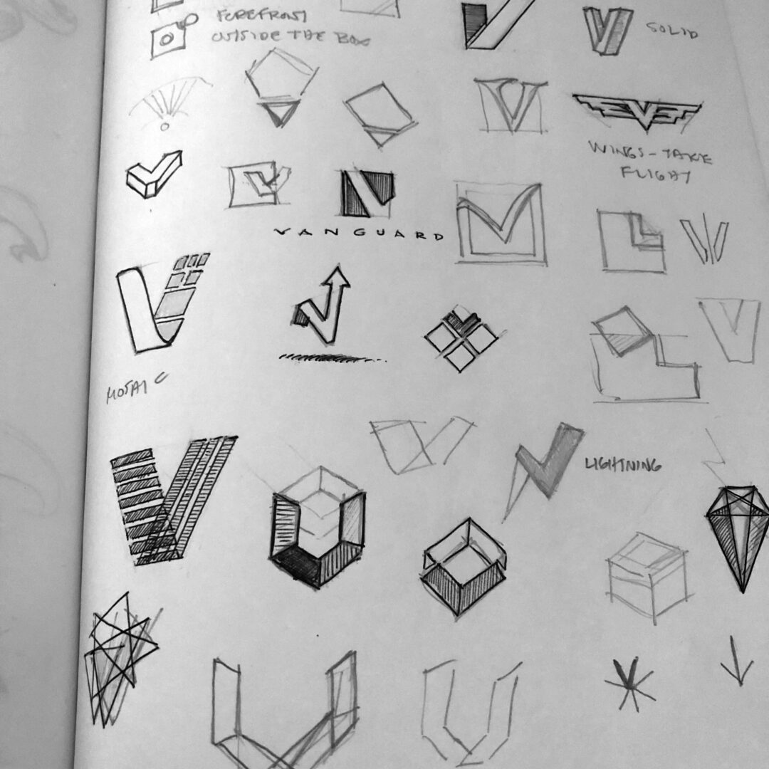
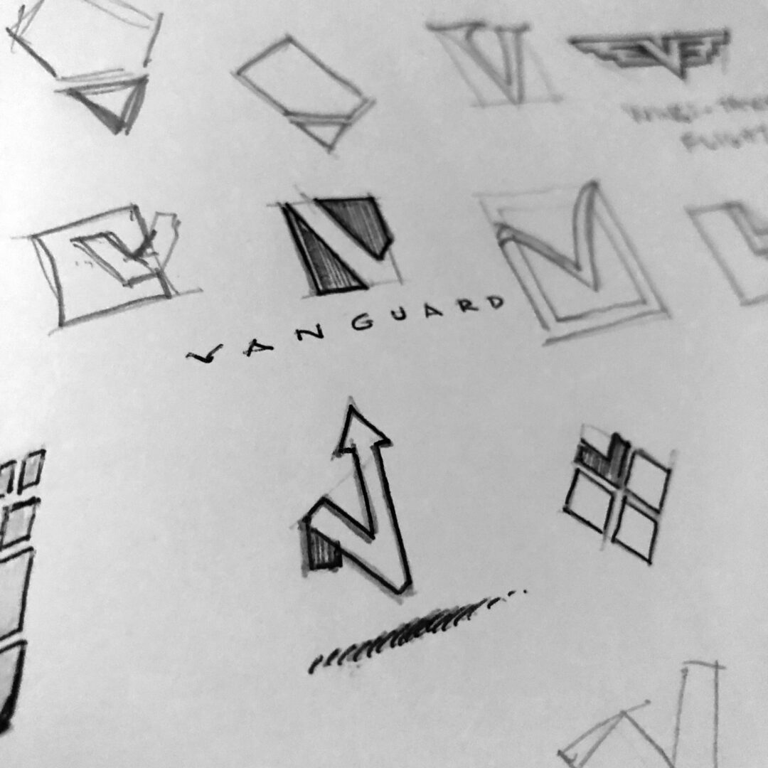
This was a quick logo for an internal initiative that involved a joint venture between two companies to support a third — none of which are the storied investment firm. This mark needed to avoid any resemblance any of the joint venture partner logos or brand guidelines. This at least, helped point the direction away from certain colors and type styles.
For the final direction, the prism represents the transformative element that is capable of combining the three players into a single entity while respecting their individual origins. Light is also a great symbol of optimism, energy and growth.


